Control Set Administration
Administration toolbar > Custom Data Sets section > Control Sets icon 
Once the admin screen opens, use the the New, Update or Delete buttons at the bottom of the screen.
Basic settings
Control Set Title: Give the control set a unique name that clearly identifies it.
Allowed Entity Types: Select and check from the drop-down box all of the entity types that the control will be allowed to be linked with. Control sets can be linked to Clients, Sites, Assets and Jobs. Note, checking entity types here does not automatically add the control set to those entity types, it just makes it possible to do so.
Category: Select from the drop-down box the category of the control set. This is a mechanism for grouping and makes searching and filtering easier. The values in this category drop-down box are administered via the System Codes screen.
Client Web Enabled?: This checkbox, when enabled will allow the control set to be viewed by Client users via the web portal.
Tab Layout
The Control Set screen has 5 tabs:
Designer: This tab is used to create the definition of the control set. This is where you add individual fields, set their properties and configure their values.
Preview: This tab will show a preview of the control set as it will be rendered via the Desktop edition of HelpMaster. This tab is useful for testing, and fine-tuning the design and layout of the control set.
Information: This tab is used to specify additional information about the control set that will be displayed to users both in the Desktop and the Web Portal.
Properties: This tab is used to display meta-data and notes about the control set.
Dependencies: Here you can view exactly where this control set is being used. From Helpmaster v22 onwards the Jobs tree will display two View Jobs in search window buttons. Clicking each button will display either jobs Logged in the past 12 months or for All Time, where the control set is linked to the job.
Control Set Field Types
The following field types are available:
Selection Types
Checkbox: A dual-state / binary control. It’s on or off, true or false, 1 or 0. etc. 2 options only. Can be used to nest/cascade additional controls (see below).
Tri-choice: A tri-state control. Useful for Yes-No-Maybe style data where there are 3 options. Can be used to nest/cascade additional controls (see below).
DropDown: A standard drop-down pick-list style control. Add as many values as you need. Can be used to nest/cascade additional controls (see below).
Date / Time Types
Date / time: A date-picker control that includes both date and time components.
Date only: A date-picker control that only allows a date (no time).
Time only: A time picker control that only allows time to be set (no date).
Formatting Types
Label: A simple label control. Used to display information.
Separator: A line. Used to separate blocks of information, or provide a visual break in information.
Text Types
Text: A standard single-line text box.
Text Multi-line: A standard multi-line text box.
Number Types
Number: A “spinner” type control that can set a whole number e.g. 4. Can be positive or negative. Can also be converted to Decimals or Currency type by right clicking.
Decimals: A “spinner” type control that can set a number to 2 decimal places e.g. 4.78. Can be positive or negative. Can also be converted to Number or Currency type by right clicking.
Currency: A currency control used to store financial values. Can also be converted to Decimals or Number type by right clicking.
Password Type
Password: A masked text box that allows you to store private data. Options include string encryption or simple masking. Whenever password fields are viewed, a system event log is recorded.
Entity Types
Client Selector: A control that allows you to select an existing client within the HelpMaster database. The type of client can be limited to the following types:
- Clients of logged in users site: Will only display clients from the same site of the currently logged-in user
- Staff members: Will display all staff members
- Clients only: Will display all clients
- All staff clients: Will display both clients and staff
- ClientsOfPrimaryClientsSite: Will only display clients from the same site of the primary client
- Custom stored procedure: Use a custom-designed database stored procedure to populate the contents of the client list
- ClientsOfPrimarySite: Will only display clients linked to the primary site of the entity or the clients linked to the parent site
- ClientsOfPrimaryAsset: Will only display clients linked to the primary asset of the entity or the clients linked to the parent asset
Site Selector: A control that allows you to select an existing site within the HelpMaster database. The type of site can be limited to the following types:
- All sites: All sites are displayed and available for selection
- SitesOfLoggedInUser: Only the site(s) that the current logged-in user belongs to can be selected
- SiteHierarchyOfLoggedInUser: Any site(s) within the site hierarchy of the current logged-in user can be selected
- Custom stored procedure: Use a custom-designed database stored procedure to populate the contents of the site list
- SitesOfPrimaryClient: Will only display sites linked to the primary client of the entity or the sites linked to the parent client
- SitesOfPrimaryAsset: Will only display sites linked to the primary asset of the entity or the sites linked to the parent asset
- SiteHierarchyOfPrimarySite: Any site(s) within the site hierarchy of the primary site of the entity can be selected
- SiteHierarchyOfPrimaryClientsSite: Any site(s) within the site hierarchy of the primary clients site can be selected
Asset Selector A control that allows you to select an existing asset within the HelpMaster database. The type of asset can be limited to the following types:
- All Assets: All assets are displayed and available for selection
- AssetsOfLoggedInUser: Only the assets(s) from the same site of the current logged-in user can be selected
- AssetsOfPrimaryClient: Will only display assets linked to the primary client of the entity or the assets linked to the parent client
- Custom stored procedure: Use a custom-designed database stored procedure to populate the contents of the asset list
- AssetsOfPrimarySite: Will only display assets linked to the primary site of the entity or the assets linked to the parent site
- AssetsOfPrimaryClientsSite: Only the asset(s) that are linked to the site of the primary client can be selected
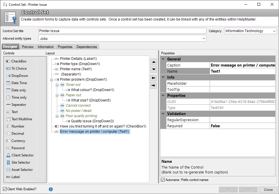
Control Set Field Properties
The Properties section of the Designer tab displays all of the properties for the selected control type.
Appearance
Background Colour: Sets the background colour of the control.
Bold: Separator control only. Changes the boldness of the separator line.
Display Type: Sets the style of the control. Choices vary depending on which control is selected.
Display When: Labels only. Labels can be configured to only show at specific times. Choose from the the following:
- Always: Label is always displayed
- CreateNew: Label is only displayed when logging a new job.
- ViewExisting: Label is only displayed when viewing a job once it has been logged
Font Colour: Select the font colour that this particular control will displayed with
Text Size: Select the size of the font for this control
General
Caption: The caption text that will appear to the user.
Items: Dropdown controls only. Click the ellipsis button to display the values that will be listed in the drop-down. Create new items by entering new values - 1 per line.
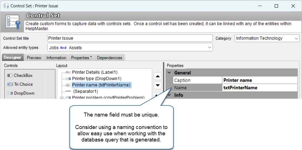
Name: The internal name of the field. This can be changed, or left as the default.
Info
Placeholder: Text controls only. Text entered here will be displayed in a grey text as a placeholder in the control. When the user starts typing, the text will disappear and be replaced with what they type. This is useful as a guide for the user.
ToolTip: Text entered here will be displayed as a tooltip if the user hovers over the information icon that will appear next to the control.
Properties
GUID: Read-only. An internal unique identifier of the control. Used by HelpMaster and the Web API to uniquely identify the control.
Type: Read-only. Displays the type of control being used.
Validation
Max: Number and Currency controls only. Sets the maximum allowed value.
Min: Number and Currency controls only. Sets the minimum allowed value.
Regular Expression: Text controls only. Select a regular expression that will be used to validate the value the user inputs into the control.
Required: Sets whether the control value needs to be specified or not.
Building a control set
Adding a control
- Click on any control from the list on the left of the screen to add it to the Layout. You can also right-click on the Layout section and select “Add control” from the popup menu.
- Use the Up, Down, Left, Right buttons to adjust the location of the control
- Repeat these steps for all of the controls that you need
Configuring the properties of a control
- Click on the control in the layout section to configure its properties
Deleting a control
Right-click on a control and select Delete from the pop-up menu. If the field has already been used and currently has data stored against it in any of the entities, a confirmation dialog box will appear. The message will indicate how many individual values are stored for it and give you a choice of how to proceed.
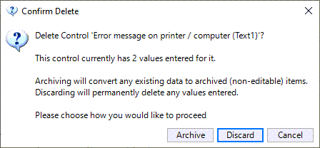
Archive: Any data already stored for this field will be archived and still viewable. The field itself will be removed from the control set so that no new data for this field can be entered (the field will no longer be part of the control set), however the data that used to be stored in this field will be retained and will be viewable for archive purposes.
Discard: Any data already stored for this field will be permanently and completely deleted from the database. Use this option only if you really mean it. There is no way to retrieve data other than a database restore from backup.
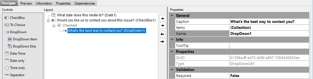
Conditional, or nested / cascading controls
Conditional cascading controls refers to the behaviour where a new control is displayed to the user if they select a certain value in a checkbox, tri-choice box, or a drop-down box. This allows for further clarification, or data input from the user because they selected a specific value.
For example. You might have a checkbox called Would you like us to contact you? that contains the following values:
- Yes [user selects this option]
- No
If the user selects Yes, you want to display a drop-down box entitled Contact method, which contains the following options:
- Telephone
- Email [user selects this option]
- SMS message
Now, based on the selection the user makes, you either want to display a text-box for the email or SMS option, or a number box for the phone number
In order to build such logic into your control set, you’ll need to cascade some controls by doing the following:
-
Right-click on the control that offers the user the choice (this will be either a checkbox, a tri-choice, or a drop-down box)
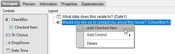
-
From the popup menu, select the appropriate option:
- For checkbox: Select Add checked item
- For tri-choice: Select Add choice options
- For drop-down boxes: Select Add Drop-down item
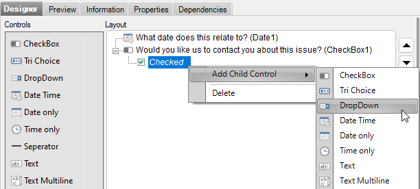
-
The new item will be created and added underneath the control. This control will be displayed to the user.
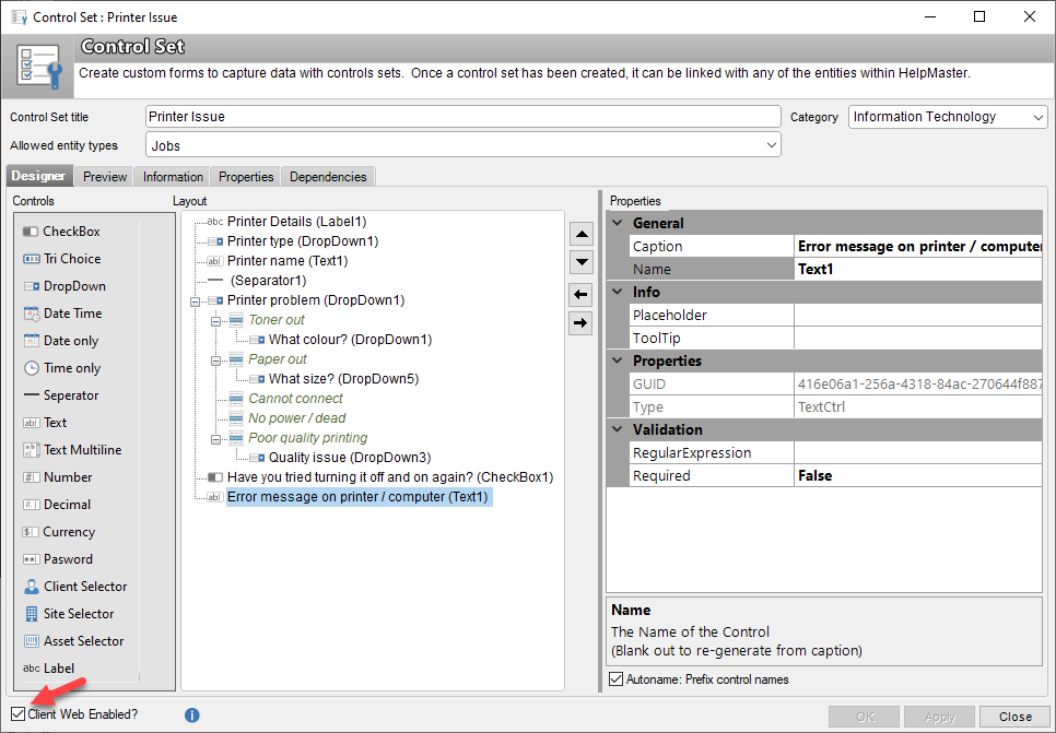
Web Enabled Control Sets for Client use
It is possible to Client Web Enable control sets which means that these fields will appear on the Log Job screen when a client goes to log a new job.
For example, a Control Set for password reset details may be defined and added to the Jobs entity type and then marked as Client Web Enabled and mandatory. This means that when the client is logging the job, this control set will appear for them, and require them to fill in any fields marked as Mandatory. Once the job has been logged, this information can then be used by the staff member assigned the job.
Web Enabling Control Sets
Follow the below steps to client web enable a control set for a job
- From the HelpMaster Desktop application, go to Administration > Control Sets and find the control set you wish to web enable
- Open the control set and ensure that the Entity Types selected has at least Jobs selected
- Check the Client Web Enabled checkbox (as shown in image below)
- Click Apply, then close the window
Control Data and Templates
All jobs logged by clients are based on web enabled job templates. If the control data for the job template is set to Required = True under Properties > Validation then the client will not be able to log the job without selecting or entering the relevant data. This is a good way to enforce relevant data entry by clients.
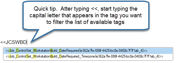
Control Set field email tags
Control Set field email tags look a little different from other email tags. They are a combination of the friendly-name + a system generated GUID (Globally Unique Identifier). Both sections of the tag are required in order to be used.
Use intellisense to select control set email tags.
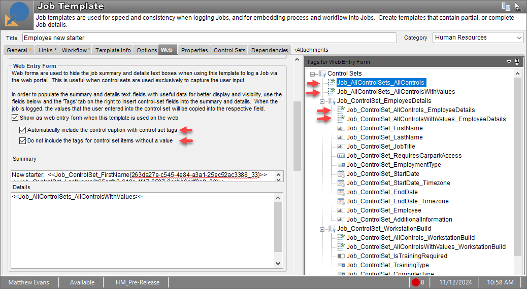
“ALL Job” Control Set email tags
Along with individual control set field email tags, from HelpMaster v24.7 there are four new types of “All” job control set tags. There is also the option to display captions along with any control set email tags or not.
Control Set Reporting Queries
The data that is stored in Control Sets can be easily accessed via the database by the use of automatically generated reporting queries. Each Control Set has an option to generate a corresponding database query whenever changes are made to that Control Set. Check the Make report queries for this Control Set in the database checkbox on the Properties tab and click Apply.
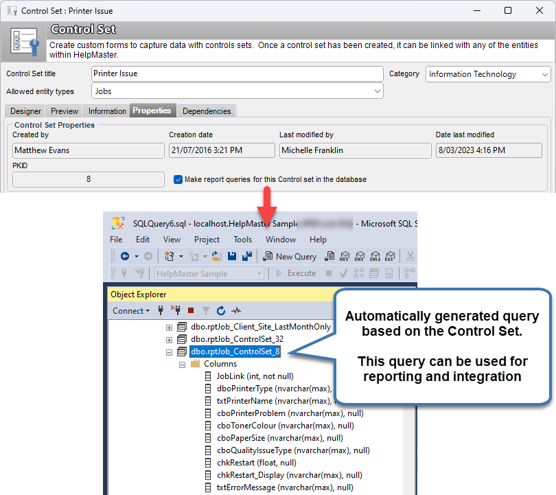
Note! In order for a reporting query to be generated for a Control Set, each field name within the Control Set must be unique. This is the Name property of the field. It is a good practice to adopt a naming convention for each field type that is both descriptive of the type of field, as well as the contents of the field. This will be helpful when working with the generated database query, and for reporting.
The Control Set database query will be created in the Views folder of your database in Microsoft SQL Server Management Studio. A view will be created for each entity type that the Control Set is associated with.
For example, if a Control Set is associated with the Job and Asset entities, the following views will be created:
- rptAsset_ControlSet_8
- rptJob_ControlSet_8
See also
Populating client and site pick-lists via a stored procedure
Adding a control set to workflow
Validating a control set value in workflow
Branching workflow based on a value in a control set
Validating control set text values with a regular expression
Job Template - Web Entry Form - Control Set Tags
Feedback
Was this page helpful?
Glad to hear it! Please tell us how we can improve.
Sorry to hear that. Please tell us how we can improve.